Tuesday, May 31, 2011

Are you kidding me? - Adore home magazine

    
Some things are ment to be, for example in the last week I have seen this coffeetable 4 times in different places: at an antique market, on the web, Spanish decor magazine AD and now on the cover of Adore magazine. They described it as a Bamileke stool/ coffeetable that is named after an African tribe and
they sell it in Australia at ecochic, here is spain it is called Babauki coffeetable.
I just found it funny that I could imagine this table, when I saw it at the antique market, in a nicely decorated livingroom, like the one of Adore home.
I am amazed that big furniture producers haven´t picked up this table to reproduce in different colours, for it to become just as popular as the chinese ceramic garden stools for example.
I woke up today thinking of writing some post about MOR beautyproducts and about the Nende Ribbon stool, guess what, they are both in the Adore magazine. Even as my most favorite blog Made by girl.
        
     If you haven´t seen her beautifull paintings yet, please check it out on the site Cocoa & Hearts

                
Another favorite is Australian interior designer Ana Spiro, where she showed her beautifull storeBlack and Spiro filled with colourfull goodies and furniture. You can also visit her blog Absolutely Beautifull things, that had a recent makeover.

                  
Another love was a story about Noosa in Australia. Noosa is my most favorite place in Australia (they call it the Australian Hamptons) and it stole my heart when we want there 5 years ago. Beau boyfriend and me travelled along the Australian coast. I have never seen such bright pink and orange sunsets and the Australian nature is amazing.
Ok, I am drifting...Adore magazine wrote about a decor shop called Signature on Hastings (I have been in that shop! and bought some candles, soaps and spoons) Such a coincidence...

Adore magazine also wrote about the Viceroy hotel, wich is high on my must visit list, yummy crepes receipes and other interior bloggers homes.

All things I love, it looked liked they had a peek in my head, and it felt like a birthday suprise with many aha moments...Thank you Adore magazine

Monday, May 30, 2011

Charlies got potential - owl umbrella stand

***My new monday post is after this Charlie the owl post, Blogger posted this fridays post first.***
This is Suze´s beautifull vignette, she has a new owl umbrella stand and she bought it here.
I have always adored an owl umbrella stand, so that´s why I want to introduce you to...


So this is Charlie (thanks Bri, because of you I am starting to name my furniture ;))
Charlie has potential, and this weekend I will prime and paint him white.
I found Charlie yesterday afternoon, he looked at me with his blue eyes saying ´´Take me home´´
I was totally happy to have found this vintage one, and soon he will be pretty holding my umbrella´s.
Read my first ever post about owl umbrella holder´s here

Hopefully on Monday Charlie looks like this
I can´t wait for this DIY magic to happen...sweet dreams Charlie, tomorrow momma is going to
give you a makeover and will make you look 20 years younger ;)

New Love - Sputnik lamps

Hope you had a nice weekend! I have to admid that I looked forward to give Charlie his transformation but it was such hot weater this weekend, that beau boyfriend proposed to go sun bathing at the beach sounded as music to my ears.           
This is my new love (obsession) It´s a vintage Emil Stejnar Sputnik lamp from the 70s.
                         
                                                         Madeleine Weinrib via pinterest
  Kelly Geisen Project
This lovely NYC interior designer Kelly G, uses many of these sputnik lamps in her designs.

This is Kelly G her kitchen, and it is one of the most beautifull kitchens I have ever seen.
Visit her website Kelly G

                      Sputnik Glass Brass Fixture

                                                                            1stdibs
                   I adore many kind of Sputnik lamps, like the above one with clear glass flowers.
                           
                                                                           pinterest
   They are so divers, and you just can´t go wrong with these, they almost match in every kind of interior.
                    French Chrome Sputnik Chandelier
                                                                                1stdibs

                     
                                                                                  via
                    zucker
                                                          Cherie Zucker                  Whiley Project
                                                                    willey design
p.s. I tried to comment on other blogs, especially on those who have left me a comment in the last week, but I can´t do it, blogger doesn´t let me comment.
Did you experience the same problem?

Thursday, May 26, 2011

Designer secrets from Peter Marino


When I begin with a new client, I always...
Listen. The client talks; I listen.

The mistake most people make when doing their own designing is...
People often know the hues they want but are unaware of the changes in value and intensity that can make or break a color combination.
                       
                                           I have been so mezmerized by this picture, Christian Dior in Paris
The most unusual request from a client was...
To convert two huge bedrooms and baths into a 95-foot-long dressing room.

For someone who wants a big look on a small budget today...
Keep it simple. One good piece of furniture or art is all you need for a room to come alive.

One of the best things right now to collect for an investment is...
Emerging artists’ work: both art and commissioned furniture.

In the area of home electronics, people are asking for...
Uni-switching systems: One button and all the shades go up or down; one button and all the lights go on a preset, on or off; one button for temporary control.

In the next ten years the most important thing in design will be...
Aesthetics and comfort, just as always.

My biggest design mistake was...
Creating a “Salon des Refusés.” I took everything that my clients refused and furnished a room full of leftovers at my country house.

My favorite room to design is...
The library. I collect rare books and drawings, so I’m inevitably drawn to that space—much more so than to the living room or the family room.
                      
                                                                 Louis Vuitton store Paris


I change my own interiors...
Monthly. I move my paintings around and always change the entrance hall. Before, it was 17th-century drawings by the Italian set designers the Bibienas; now it’s white paintings by Robert Ryman and Miguel Barceló.

There are many rules designers should bear in mind. One is...
Place something bought in the current year in every room.

The order I follow when I design is...
Make sure the architecture is great, first and foremost—as everything else is easily changed.

Every home must have...
A soul.
                
Design likes and dislikes...
Likes: Anything real, artistic license, intelligent architecture, Southeast Asian hand-loomed silks.
Dislikes: Copies of antiques, copies of existing rooms, window treatments, unflattering light.

My personal dream house would be...
A glass box on a green hill.

Who or what has influenced my style...
Marella Agnelli, Jean-Michel Frank, Victoria de Rothschild, Andy Warhol, Fred Hughes, Fernand Léger, Louis Kahn.

Three essentials for entertaining are...
Good food, served quickly. Good company: a mix of people. A relaxed host and hostess who enjoy themselves.

If I could live anywhere (other than where I am), it would be...
I would never consider leaving New York. Ever. Not for two nanoseconds.
                                                               Read more:

Wednesday, May 25, 2011

Grey and Lavender

                         
Still liking grey and lavender, I saw this greek key chair with zebra fabric.
If you take away the zebra chair the livingroom looks pretty classical, but the zebra chair makes it
interesting to me.

My vegetarian sandwich

This is my lunch for today, home made vegetarian sandwich.
It´s toasted spelt bread, hummus, advocado, salt, pepper, lemon drops, tomato, line seed oil and fresh basil.
And it´s yummy even for a carnivore like me.

Last few months i had a very dry skin and my hair was dull. It was time for a change.
To get better skin I started to go to swimming in the pool, eat more advocados, fresh nuts, fruits, line seed oil and it has worked miracles, my skin and hair are so much better now.
What did you do this year that has changed you in a positive way?

Tuesday, May 24, 2011

Colour contrast


Petra Bindel - PB_hanne&hans_0001.jpg
In an interior where white walls, a dark floor and grey hues dominate, it´s always joyfull to see little pops
of colour.
Petra Bindel - _MG_0132.jpg

                                 Petra Bindel - PB_1239.jpg

                               Petra Bindel - PB_hanne&hans_0268.jpg

                                Petra Bindel - senaste8bitars_0346.jpg
                                                                     via

Monday, May 23, 2011

Loods 5 - A dutch interior stylist´s heaven

Loods 5 is one of my favorite places in Holland to buy furniture, they have almost anything, all diferent styles, from nursery´s to kitchens, you name it, they have it.

Here is a movie that gives you an impression how big this shop is. Try to see it without the music (you can hear the man breathing- ugh, and I hope this rollercoaster way of filming doesn´t make you dizzy)

The man filming should have been pushed around in one of those shopping carts for the movie not to been so bouncy. Well I hope you liked your Dutch shopping experience.

Here are a few online pieces of furniture that I liked...I warn you many chairs, chairs and chairs
                                                                            Chair Nicole
                                                                   DSR Eames chair
                                                               Xavier Puchard chair
                                                              Eames rocking chair
                                                                  Gringo Side chair

                                                                             Brussels rack

                                                                         Bety Kitchen unit

If you move to Holland, go and visit Loods 5 

Friday, May 20, 2011

Small change - huge difference

The lovely ladies of Matters of Style, tackled a problem.
They had a clearglass lamp and a clear glass directoire sidetable, and for the lamp to stand
out, they simply painted the glass of the table black and voila!
Look how pretty!
this is the before
Go and read the whole post on their blog.
I just added a directoire table on my wish list!
(honey, if you read this...we need to move to a bigger place)

Our livingroom on Decorpad

While search for some pretty images of x-benches on Decorpad, suddenly my hart skipped a beat...I recognized my livingroom and said ´´what the x...´´
Suprised that someone actually liked it enought to add it to the Decorpad website, i was very proud.
see it here

Thursday, May 19, 2011

x-bench - still desiring it

  
                                    Grey fabric with white piping = très chic mon cherie
I am looking for four of these benches, yup it´s almost impossible to find one, so why do I need four?
One of my best friends is currently building her house and she and I will go furniture hunting,
she shares the love of these x-benches, so that´s why I want two for her and two for our bedroom.
I will keep on dreaming, here are some pictures to drool on.
living rooms - White Crocodile X Bench taupe linen French sofa gray linen throw pillows turquoise blue circles throw pillows gray tufted round storage ottoman black cream zebra rug white faux leather gold faux bamboo tray tables silver urn lamps fish art soft gray walls
White crocodile leather x-benches = a dream

This the state that you normally find them, imagine them upholstered with your most favourite fabric
Eliz bauer x bench
like this black and white zig zag pattern
          living rooms - Behr - Squirrel - gray taupe brown yellow Jonathan Adler x-bench geometric black white Greek key rug rabbit art dark gray walls paint color black yellow gray living room
                                   
   boy's rooms - Jonathan Adler Giraffe Sconce glossy blue chest blue cornice box drapes sand beige grasscloth wallpaper white twin headboards blue bedding white blue striped x bench stools red faux bamboo chandelier


Are you a lucky owner of a x-bench? If so, in wich colour did you make them?

Wednesday, May 18, 2011

Inspirational DIY roomdivider


Have you collected vintage scarfs before and now you don´t know what to do with them?
Pull out your sewing machine and make this Roomdivider.
NOTE: don´t use your vintage Hermes and pucci ones, that would be a pitty.
If you don´t have them, start buying them at flea markets, garage sales, vintage boutiques....anyware, they always come in handy.

Tuesday, May 17, 2011

It´s time for Peonies

They are back at the florists, one of my most favourite flowers.
I mixed 3 colours together (but the fucsia/coral colour is gorgeous) and placed them in my
Moet & Chandon Champagne bucket.
 These buckets are so multifuncional.


It´s hot, hot, hot!

If you have sunny weather, this thing might be the last thing on your mind.
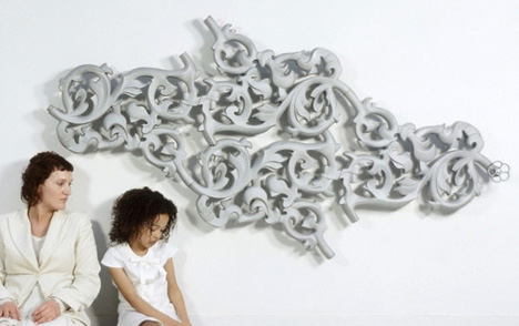
It´s a radiator made by dutch designer Joris Laarman, and it´s called ´´Heat Wave´´.

The design is Rococo inspired and is composed of heating pipe with fiberglass reinforced concrete and is manufactured and sold by Droog Design. Due to it’s design and enlarged surface area, the Heatwave conducts heat far better than a traditional metal radiator or floor heating.
It´s something so beautifull that you don´t mind to show this in your house

And how about this...it´s is called ´´ Wire Pod´´ and it´s a elegant and beautifull extension cord.
I personaly like things that you normally like to hide in your house, can be pretty and show worthy.
More information about Joris Laarman and the designs he makes, here